Typeface: the design of a collection of characters
Font: Single instance or embodiment of a specific weight, width, or style of a typeface
Typography... Major component of branding, Readability is important, Accessibility(not just using colors or icons, using actual text is important for better accessibility)

WCAG guideline about typography contrasts
| Type of content | Minimum ratio (AA rating) |
Enhanced ratio (AAA rating) |
| Body text | 4.5 : 1 | 7 : 1 |
| Large-scale text (120-150% larger than body text) | 3 : 1 | 4.5 : 1 |
| Active user interface components and graphical objects such as icons and graphs | 3 : 1 | Not defined |
Serif Sub-Genres
Humanist - 14th century
Diagonal stress, Lower stroke contrast, relatively small X-height
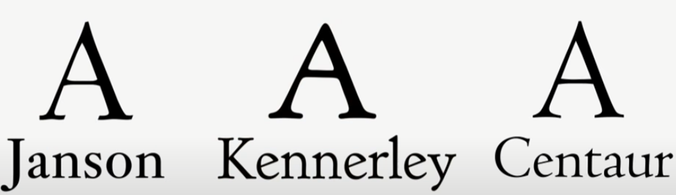
Janson, Kennerley, Centaur
Old Style - 15th century
Less diagonal stress, serifs are more wedge-like
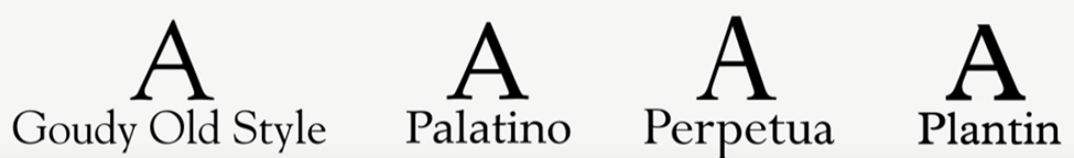
Goudy Old Style, Palatino, Perpetua, Plantin
Transitional - 18th century
More Vertical stress, thinner flatter serifs, exaggerated contrast between thins and thicks

Baskerville, bookman, clearface (ITC)
Didone- late 18th century
Serifs are thinner, thick verticals, thin horizontal, contrast is extreme between thins and thicks
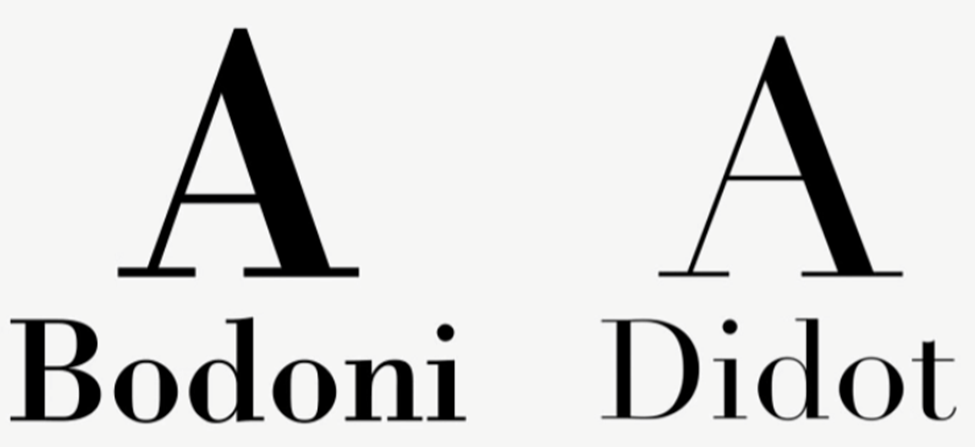
Bodoni, Didot
Slab- Early 19th century, heavily used for titles headlines
Extremely thick serifs, almost no contrast
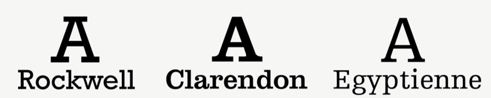
Rockwell, clarendon, Egyptienne
Sans-serifs sub-genres
Grotesque- late 19th century
They were not familiar at that time, they are derived from Didone

Akzidenz-Grotesk, Franklin Gothic
Neo-grotesque
On purpose of refining some of the peculiarities in early grotesques. Because of the simplicity and similarity affect legibility, they are not the best candidates for the body copy.
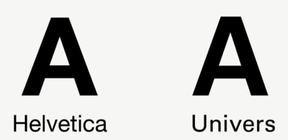
Helvetica, Univer
Humanist Sans
Considered as most legible one. Modulation of the line thickness creates distinct character shapes. (easier distinguish, easier to recognize)

Tahoma, Gill Sans, Frutiger
Geometrics
Based on geometries, circles, squares, and triangles.
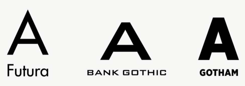
Futura, Bank Gothic, Gotham
Print Design vs Digital Design
You need to put loading time and cost in consideration.. (consistency among the users, too IMO, isn't it duh btw)
| Desktop Fonts | Web Fonts |
| -Stored locally -work well with installed applications -Intended for print and desktop apps |
-Not stored locally -Intended for websites and apps |
Fixed vs Fluid layouts
magazine, papers and stuff, it's always same. Fluid means web. it's different by the monitor sizes and devices.
*the reason why we put helvetica and arial as a default font is... helvetica is default font of Mac, and arial for Windows (damn I didn't know that, wtf)
Font installation formats
Opentype (.otf) - preferred format, has the most customization options, widespread support accross platforms
TrueType (.ttf) - used to be used before the .otf
EOT (.eot) - Microsoft developed. Only works in internet explorer
WOFF (.woff) - Compressed
WOFF2 (.woff2) - Newer, more compressed. well supported for many platforms. works great with Internet Explorer
SVG (.svg) - not recommended but to support very old versions of safari
Display Typefaces(Title, Header, Big, Iconic) VS Text Typefaces(Legibility, Readability, Comfy)
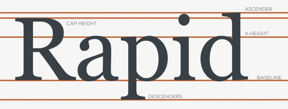
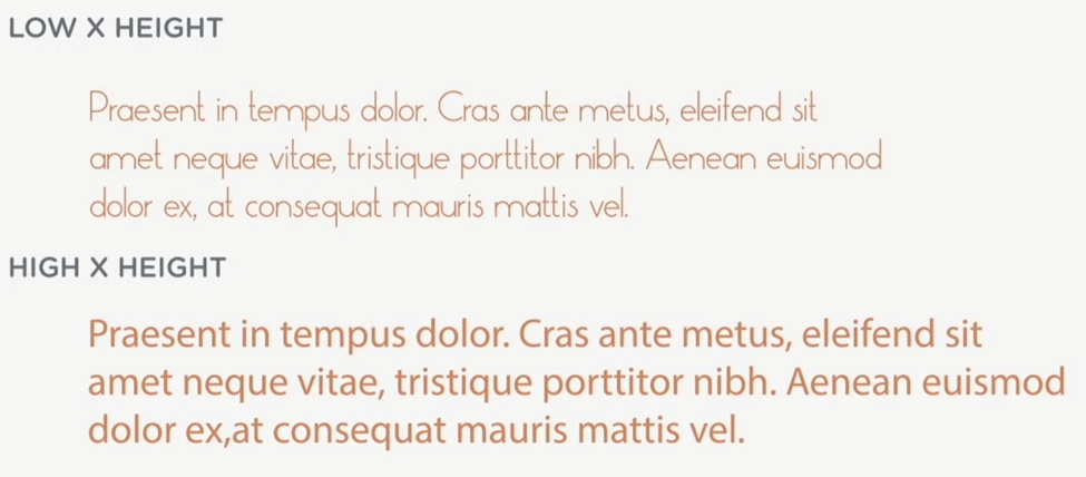
X-height matters (good x-height is 60-75% of Cap height)
Too low: makes lower cases hard to read, and not really good when text is small
Too high: makes it hard to discern what's lowercase and what's uppercase
White spaces
Letter-spacing: it's not recommended to manually change the letter-spacing. Find a typeface that already has proper letter-spacing. To find a proper typeface, blur the text intentionally to see any gap area between letters.
Counters: Completed closed circular things in the letters, e / o / b / d and stuff.

Short Ascenders and Descenders help legibility in Display typefaces.
Header or title doesn't mean that it can have low legibility typefaces. (who wants to read if it's not legible?)
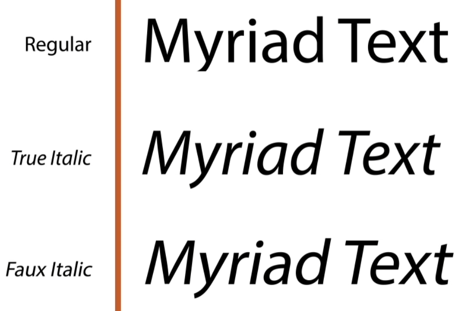
Faux bold, Faux Italic, Faux Pas - translation? Don't Do Them.
*faux means fake, false. this means using software to make them bold, italic. or whatever.


Type-scale.com
fluid-type-scale.com
- 45-75 characters per line for a single column of text
- tighter letter-spacing results in a heavier feel, looser letter-spacing results in a lighter, aerial look.
- slightly reduce the tracking(letter-spacing) in headings by 3-5% to have a heavier feel.
- do not change the tracking in body copy unless it's absolutely necessary to aid legibility.
- don't track your type out too much as words and spaces will get muddled.
- increase tracking in small caps or uppercase text by 5-10%.
- choose metric tracking, which uses character-spacing information inside the font.
Kerning: The amount of space between a specific character combination rather than the spacing of a whole body of text.
*Letter-spacing affects the spacing of the text as a whole. Kerning deals with specific pair of letters.
Ligatures: Improve the appearance of text for letters that are too close together, like the f and the i.
(like this, fi fl fh. or fig )
Leading: (line height, line spacing)
Tips for setting paragraphs with indentation:
The Recommended amount of indentation is around the size of the body text. It should be no larger than four times the text size.
Don't indent the first line... of the first paragraph, after a heading, after an image or any other figure
Don't add extra space between the paragraphs. (because indentation would do that)
Utilizing Small Caps:
Official Title, Abbreviation, Category, Sub-Header(or Header)
The President of United States, Asap, Category One

this post is a note from a youtube by Hope Armstrong
https://www.youtube.com/watch?v=agbh1wbfJt8&ab_channel=freeCodeCamp.org
This one was a good read, too. watch that SNL episode please. Papyrus!
The Deadly Sins of Graphic Design - 6 Faux Pas
Graphic design is a profession that embodies skill and precision in order to effectively communicate. This requires strict guidelines and standards that go into turning our work into a success for our clients. Any mistakes or oversights can potentially dam
www.thundertech.com
'Study > UIUX' 카테고리의 다른 글
| KANO model and RICE method (0) | 2022.04.20 |
|---|---|
| Starbucks iPhone application disassembly - iOS Sheet usage (0) | 2022.04.05 |
| Website elements (0) | 2021.06.05 |
| Scrolling (0) | 2021.05.04 |
| Sitemap Concerns (0) | 2021.03.30 |