*This is based on the US version, 04/04/2022.
It's been slightly over 3 weeks since I changed my phone to iPhone from Samsung galaxy. While I was figuring out and getting used to the new interfaces and interactions, the Starbucks app was extremely easy to use and consistent in interactions and designs. I was wondering why. One thing I noticed is that the action card is getting along with the home indicator (aka home bar). Later on, I found that the action card's actual name is sheet.
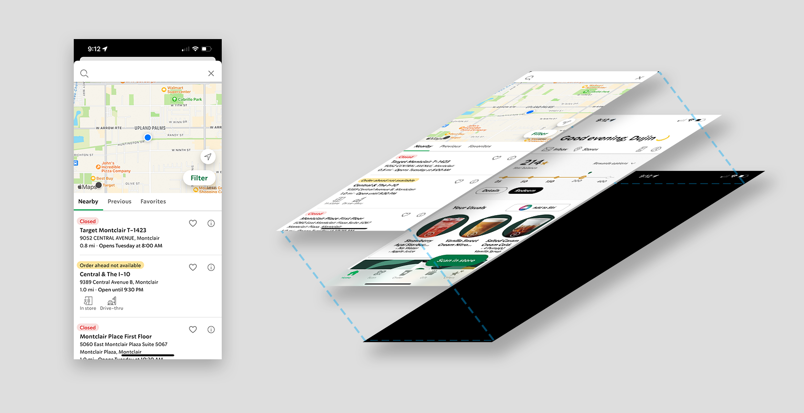
Based on apple's document, sheets should be used for "nonimmersive content and simple tasks". And Starbucks app used it very well. There are two types of sheets, large and medium, and Starbucks app uses the large one mostly (except Redeem page, that's the only one I found) can't tell the exact reason why, (they have tons of better designer than me, duh) but it gives coherent experiences throughout all pages. Not only that, sheet is used only for frequently opened and closed pages.
Details (On Rewards) - Users check what rewards is and that's it. This page doesn't need to make users over-focused.
Order (Tab Bar, only on specific situations!) - When the user needs to choose a store, this will appear, like confirming the store, or changing the store. Imagine if this was a separate page, it will give the user a "separated feeling" between starting order and checking out, which probably makes the users think once more about the purchase and make them stop ordering. Instead of that, by using sheet, it feels very smooth between the pages.
Check Out - What if you want to change your order, what if someone in the backseat want to change the order
alright I'm sleepy again, I'm going to finish this tomorrow. By the way the post below is very useful!
https://sarunw.com/posts/bottom-sheet-in-ios-15-with-uisheetpresentationcontroller/
to do list
1. all other iPhone app standards
tab bar - https://developer.apple.com/design/human-interface-guidelines/ios/bars/tab-bars/
sheets - https://developer.apple.com/design/human-interface-guidelines/ios/views/sheets/
navigation bar with the standard title - https://developer.apple.com/design/human-interface-guidelines/ios/bars/navigation-bars/
Navigation Bars - Bars - iOS - Human Interface Guidelines - Apple Developer
Navigation Bars A navigation bar appears at the top of an app screen, below the status bar, and enables navigation through a series of hierarchical screens. When a new screen is displayed, a back button, often labeled with the title of the previous screen,
developer.apple.com
Sheets - Views - iOS - Human Interface Guidelines - Apple Developer
Sheets A sheet helps people perform a distinct task that’s related to the parent view without taking them away from their current context. For example, Mail uses a sheet to help people compose an email without leaving their mailboxes, and Translate uses
developer.apple.com
Tab Bars - Bars - iOS - Human Interface Guidelines - Apple Developer
Tab Bars A tab bar appears at the bottom of a screen, helping people understand the types of information or functionality an app provides. Tabs let people quickly switch between top-level sections in your app while preserving the current navigation state w
developer.apple.com
'Study > UIUX' 카테고리의 다른 글
| What are design tokens? (2) | 2022.07.15 |
|---|---|
| KANO model and RICE method (0) | 2022.04.20 |
| Typography for developers tutorial note (0) | 2022.03.14 |
| Website elements (0) | 2021.06.05 |
| Scrolling (0) | 2021.05.04 |