
I made a favicon for my portfolio website
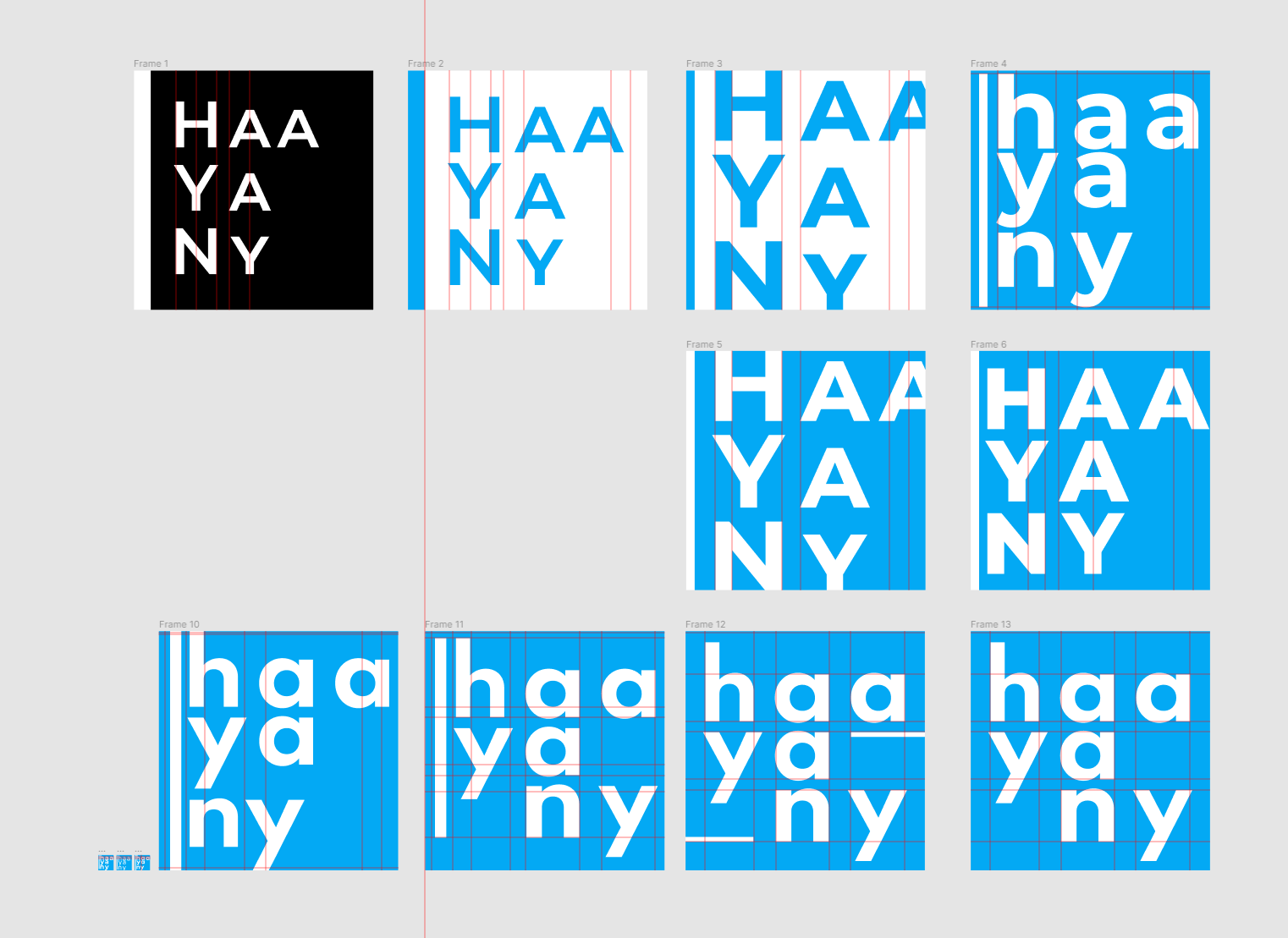
haayany, but because of Y's descender, and bigger whitespace caused by that, it makes a separation between haaya and ny. (it sometimes seems like haaya, new york)
so the last two, I put ny little to the right so that vertical whitespace can be even. However, now it gives more whitespace. To remove the feeling that is separated, I placed two horizontal lines.
https://developer.apple.com/design/human-interface-guidelines/ios/icons-and-images/app-icon/
App Icon - Icons and Images - iOS - Human Interface Guidelines - Apple Developer
App Icon Every app needs a beautiful and memorable icon that attracts attention in the App Store and stands out on the Home screen. Your icon is the first opportunity to communicate, at a glance, your app’s purpose. It also appears throughout the system,
developer.apple.com
https://developer.android.com/studio/write/image-asset-studio
Image Asset Studio로 앱 아이콘 만들기 | Android 개발자 | Android Developers
Android 스튜디오에는 Image Asset Studio라는 도구가 포함되어 있습니다. 이 도구는 머티리얼 아이콘, 맞춤 이미지, 텍스트 문자열에서 고유의 앱 아이콘을 생성하는 데 도움이 됩니다.
developer.android.com
'Study > DailyUI Challenge' 카테고리의 다른 글
| #DailyUI 003 Landing Page (0) | 2022.03.29 |
|---|---|
| #DailyUI 004 Calculator (0) | 2022.03.29 |
| #DailyUI 002 checkout (0) | 2022.03.16 |
| #DailyUI 001 Sign Up Screen (0) | 2022.03.15 |